
Choosing Colours for a Paris Apartment: Light, Ceiling Height and Orientation
Choosing the right colours in Paris: how light, ceiling height and orientation transform a palette and enhance mouldings and woodwork.
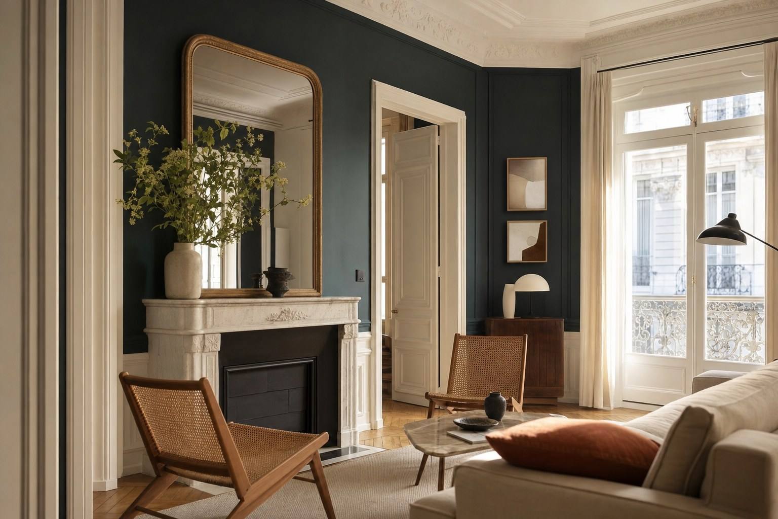
The same shade can look ravishing in London and disappointing in Paris. It is not a matter of taste; it is a matter of light. Parisian light, that slightly silvery clarity, filtered through zinc rooftops and often-clouded skies, does not render colour as the hard sun of the South would. Add to this ceilings of more than three metres, inherited from nineteenth-century buildings, and you have a singular chromatic terrain, where rules learned elsewhere no longer quite apply.
That is precisely what makes choosing colours for a Paris apartment so fascinating: light and generous ceiling heights change the rules of the game. A deep blue that would weigh down a low room becomes sumptuous beneath a five-metre ceiling edged with mouldings; a white that feels too cool, sublime in a south-facing room, turns to dirty grey on a north-facing façade. Before choosing a colour chart, you must therefore learn to read your apartment, its orientation, its volumes, its ornamentation. Here is how.
Understanding light according to orientation
No colour exists in absolute terms: it is the product of pigment and the light that falls upon it. In Paris, where the same room can shift atmosphere three times over the course of a day, orientation is the very first factor to consider, even before the colour itself.
North: warming without falsifying
North-facing rooms receive constant but cool light, with a slight bluish cast. Whites easily turn grey; greys become flat. The temptation is to answer with pure white to “gain brightness”, often a mistake. It is better to warm the palette: off-whites, rosy beiges, luminous greiges, shades with yellow or red undertones that compensate for the ambient coolness. A north-facing room can also beautifully embrace an enveloping, dark colour, turning the lack of sun into a hushed atmosphere rather than fighting against it.
South: daring to go deep
To the south, the light is generous and warm for much of the year. It is the most forgiving orientation: it can carry cool colours without extinguishing them, reveal subtle nuances and flatter deeper tones. Greens, blues and rich greys all come into their own here. The only pitfall: overly warm whites can appear yellowed in full light.
East and west: working with the hour
- To the east, the light is bright and fresh in the morning, then recedes in the afternoon. Ideal for a bedroom or kitchen used early in the day.
- To the west, the room catches fire at the end of the day in a golden, almost orange light. Warm tones glow at sunset, but can feel subdued in the morning.
The right instinct: observe the room at several times, early, at midday, in the evening, and always test a paint sample on the wall, never on a colour card simply held in your hand.
Colour and ceiling height
This is the great Parisian luxury: height. In a classic apartment from the late nineteenth century, ceilings often reach 3,20 m, sometimes higher on the noble floors. This generosity of volume allows for chromatic boldness that would be impossible elsewhere.
A dark colour, midnight blue, forest green, deep earth, that would overwhelm a low room becomes enveloping and theatrical beneath great heights. The volume absorbs the intensity of the shade rather than suffering under it. Where a recent studio with a low ceiling would call for restraint, the haussmannien living room can permit itself a sense of drama.
A few principles drawn from these volumes:
- The ceiling is not condemned to white. Painting it in a shade slightly lighter than the walls, or in the same tone, softens the height and creates an elegant cocoon.
- A darker dado visually anchors a very large room and recalls the spirit of historic interiors.
- Light tones enlarge, but can sometimes flatten. In an already spectacular volume, a confident colour brings more character than an all-white scheme.
In other words, height is not merely an aesthetic asset: it is permission. It offers a freedom few interiors possess, provided one dares to use it.
Enhancing mouldings and woodwork
Mouldings, cornices, ceiling roses, wood panelling: these are the signatures of a Paris apartment with character. Colour can either reveal them or soften them away, and both approaches are legitimate, provided they are deliberate.
The classic contrast
The traditional solution is to paint mouldings and cornices in a clear white, in contrast with coloured walls. The relief stands out, the ornament tells the story of its era, and the reading of the volume is crisp. It is a safe, luminous, resolutely heritage-minded choice.
Contemporary tone-on-tone
The more contemporary approach, and often the most sophisticated, is to paint walls and mouldings in one and the same shade, including the woodwork and sometimes the ceiling. The ornament does not disappear: it reveals itself through the play of shadows, softly, without a break in colour. An entire room in muted green or deep grey, mouldings included, breathes the hushed elegance so sought after today.
Woodwork and parquet
Historic woodwork almost always benefits from being preserved and repainted rather than removed. As for parquet point de Hongrie or bâtons rompus, its natural tone, from pale honey to patinated brown, is an integral part of the palette: it is a colour in its own right, one with which the walls must enter into dialogue, never competition.
Timeless palettes vs trends
Every colour follows a fashion, and fashions pass quickly. In an apartment renovated for ten or twenty years, the question deserves thought: how much room should be given to the timeless, and how much to the spirit of the moment?
The sure values, those that cross the decades without dating in a Parisian setting:
- warm and off-whites, timeless across generous volumes;
- greiges and taupes, neutral but never cold;
- muted greens (sage, olive, fir) and deep blues, in perfect harmony with mouldings;
- mineral tones, stone, slate, clay, echoing the building’s materials.
Trend colours, by contrast, bring freshness and personality, but date more quickly. The wisest strategy is to reserve them for surfaces that can evolve easily: a single wall, a piece of furniture, textiles, rather than the entire apartment. In this way, you keep a calm and durable foundation that can be refreshed as desires change.
In brief In Paris, light and height dictate colour. Warm north-facing rooms, dare depth to the south and beneath high ceilings, choose between contrasting mouldings or tone-on-tone, and build your palette on enduring neutrals lifted by freer accents. Always test on the wall, at several times of day.
Finishes and materials
It is often forgotten: a colour is not defined by its pigment alone, but also by its finish. The same green will appear muted and deep in matt, brighter and more luminous in satin. This is a decisive lever, particularly in shifting Parisian light.
A few useful points of reference:
- Matt absorbs light and softens the imperfections of an old wall: ideal for broad fields of colour and ceilings. It is the most contemporary, most hushed finish.
- Velvet or eggshell, lightly satinised, offer a good compromise: the softness of matt with greater resistance to cleaning. Perfect for living spaces.
- Satin and lacquer, more reflective, enhance mouldings, woodwork and joinery, and make exposed areas easier to maintain.
Material carries colour beyond paint. A limewash or mineral plaster wall vibrates differently from a smooth wall: its tone seems alive, almost nuanced according to the hour. Brass, wood, stone and linen add their own tonalities and warm a palette. To think about colour in a Paris apartment is ultimately to orchestrate a whole, walls, floors, light, materials, so that each shade finds its rightful resonance.
This dialogue between the light of the place, its volumes, its ornamentation and your colours lies at the heart of Lumiera’s work: composing palettes that respect the character of a Paris apartment while carrying your own contemporary note.
A project in Paris? Let’s discuss the palette that will reveal the character of your apartment in its truest light.